Problem
You have to provide access to options or controls across the application, but a Revealable Menu is already in use, or would be unsuitable due to lack of controls or conflicts with other key interactions.
The general style of the menu structure will often be dictated by the OS. There is generally much leeway in implementation, if variation from this is desired or called for.

Solution
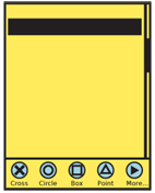
An always-visible menu or control set is docked to one edge of the viewport.
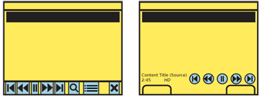
Regardless of the OS-wide standard, you should often use a visible menu for media players, cameras and other applications where a key set of controls or options should be visible at all times. Any time your users have a need for immediate action, or a learning curve must be avoided (discovering a Revealable Menu) then a Fixed Menu is a good solution.
When your can also use the menu to indicate position in the system, such as there is an icon for each page, this is instead a set of Tabs, and not a menu.
Note that this pattern is being used only if it happens across the entire OS or an entire application. Controls on a single screen, such as zoom, pan and playback functions for a weather radar image, are simply controls. Playback controls for a video player which are the same in all modes of the application, are a Fixed Menu.
For gameplay, video playback or other full-screen displays such as readers may call for suppressing the Fixed Menu. It may be replaced with a Revealable Menu which opens in the same position.
Variations
Use the Fixed Menu to display a simple list of available options. These are generally displayed as a horizontal bar, so the options should usually each be displayed as an individual Icon, each with an with associated text labels.
These may be used as the primary menu structure, but are often used in concert with a Revealable Menu, in which case they must be deconflicted. Both are best when placed along the bottom of the viewport. However, if the closed paradigm for the Revealable Menu has visibility, that may need to be changed, the visible tabs minimized in some manner, or the Fixed Menu may need to float higher up or be attached to a different side of the viewport. This may cause the Fixed Menu to be arranged vertically or horizontally.
On touch devices, the bottom of the viewport provides an additional advantage in that it may be easier for the user to reach, and submenus open up, so will not be obscured by the user's hand.
Pure text lists are also sometimes used, and generally follow the desktop metaphor (File|Edit|View|...), so are always horizontally arranged. You can only use this successfully with a sufficiently large display. Avoid letting functions fall off the screen, as is shown in certain Tabs.
A Fixed Menu may include all options or controls required, or may offer subsidiary or additional lists of options.

Interaction Details
Fixed menus are either used for pen and touch devices, or when the page content does not have to be interacted with directly, such as video playback; the controls are the primary interaction method.
Fixed menus are not contained in a modal dialogue, so you can offer interaction with the entire page's content, as much as needed. If it is not accessed as a matter of course, such as for video playback, this does not change the general state of the interaction. Other controls may also exist on the page, and are accessible at any time.
For devices with 5-way pads, opened menus should be able to be scrolled through. Touch and pen devices use direct selection of the items in the menu. For controls, drag and other gestural actions (such as to change zoom level or jog to another portion of a video file) may also be supported.
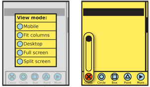
Selection of any single item will initiate the action, which may load a new page, change states of the current content, cause a modal dialogue of options to appear, or even exit the application. When the options in a subsidiary dialogue are simple, they should be docked to the original selection. If you must prevent obscuring of the primary content, or if selection inherently disrupts other primary functionality, these subsidiary menus may be press-and hold items; with touch or pen devices, press the menu item, then drag over to the selection and release when it is focus.
If you must place more items a menu than can be fitted to the main menu, then a subsidiary menu will be opened. This is typically a Pop-Up dialogue with a Vertical List. When practical, to comply with the iconic presentation of the main menu, you may draw this as a Thumbnail List, where the thumbnails are also icons.

Presentation Details
You should always lock the main menu to the viewport, and prevent it from scrolling off the screen. Do not allow the scrollbars to overlay the menu, to make this clear. Usually, to comply with the expectations for menus on mobile devices, it is along the bottom edge, though may be along a side to avoid conflicting with Revealable Menus or along the top (below any Annunciator Row) to follow desktop a application paradigm. Keep in mind the issues of interaction conflict and obscuring described above when placing the menu anywhere except the bottom edge.
The menu is present in all screens and states of an application, but may be hidden temporarily for media playback or otherwise to give more room to the primary content. This hiding follows that of other fixed on-screen elements, such as scrollbars, Titles, or the Annunciator Row. Since they re-appear by general interaction or after a time, and no explicit retrieval of the menu action is available, this does not convert the menu to the Revealable Menu pattern.
Antipatterns
If hiding is routinely employed to retrieve on-screen space taken up by a Fixed Menu, reconsider the selection of this pattern. It is likely that a Revealable Menu is more suitable instead. Carefully consider the importance of consistency across the interface and the OS.
Do not stack multiple fixed menus on top of each other. Avoid having fixed menus immediately adjacent to other interactive bars of the same shape, such as a Notifications area. If this is the only suitable solution, prevent accidental activation through the use of gesture. You may make the items of the Fixed Menu tappable, but require a drag gesture to open the Notifications, for example.
Next: Home & Idle Screens
Discuss & Add
Please do not change content above this line, as it's (so far) a perfect match with the printed book. Everything else you want to add goes down here.
Chyron
So, a key think for many fixed menus is they are not really unique to menus. They are just bars of stuff docked to the bottom of the viewport. We also sometimes dock buttons, and other types of actions, and advertising and so forth.
What if we used a nice generic for all of these? Going to other media, the overlays for labeling who's talking in TV production (and other motion video) is called a Lower Third generically, and a chyron (sounds like Chiron to me, not that this is helpful to you) to my recollection. This seems like a good word. I might start using it if I remember to, and generically make such a section when and if I revise this work.
Make a new section
Just like this. If, for example, you want to argue about the differences between, say, Tidwell's Vertical Stack, and our general concept of the List, then add a section to discuss. If we're successful, we'll get to make a new edition and will take all these discussions into account.
